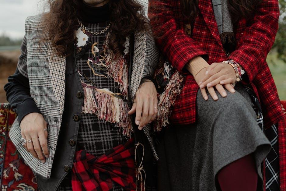
In the vibrant world of fashion,print mixing is a powerful expression of individuality and creativity. Gone are the days when matching fabrics dictated a polished look; today’s style landscape invites bold experimentation and a festivity of contrasts. The art of mixing prints is not merely about clashing colors and patterns; it’s a nuanced dance that balances visual harmony with personal flair. Whether it’s the clash of florals with stripes or the playful interplay of geometric patterns, the right combinations can transform a simple outfit into a statement. As we delve into the intricacies of this dynamic trend, we will explore guiding principles, practical tips, and inspirational examples that illuminate how anyone can master the art of mixing prints, turning everyday attire into a canvas of self-expression.
Exploring the Color Wheel: Understanding Harmonious Combinations
Understanding the color wheel is essential for anyone seeking to master the art of mixing prints. At its core, the color wheel illustrates how colors relate to one another, allowing designers and enthusiasts alike to create visually appealing compositions. when exploring harmonious combinations, consider the following principles:
- Complementary colors: These are colors that sit opposite each other on the color wheel, such as blue and orange, which can create a striking and dynamic look when mixed.
- Analogous Colors: Comprising colors that are next to each other,such as teal,green,and blue,these combinations provide a more subtle and cohesive vibe.
- Triadic Colors: Formed by equidistant colors on the wheel, like red, yellow, and blue, these combinations can add vibrancy and balance to your prints.
To help visualize these concepts, here’s a simple comparison table showcasing color combinations that work well together:
| Color Pairing | Combination Type | Visual Effect |
|---|---|---|
| Blue and Orange | Complementary | Bold and Energetic |
| Green, Blue, Teal | Analogous | Calm and Harmonious |
| Red, Yellow, Blue | Triadic | Vibrant and Balanced |
Balancing Proportions: Tips for Layering Different Patterns
When it comes to layering different patterns, the key is to maintain a sense of balance and harmony in your outfit. Start with a dominant pattern that captures the eye, ensuring it acts as a foundation for your ensemble. Then, introduce secondary patterns that complement rather than compete with the main one. A great approach is to adhere to a color palette. As an example,choose patterns that share similar tones,which can create a cohesive look even when the designs differ in intricacy.
Next, consider the scale of the patterns for effective layering. Mixing a large floral print with a smaller polka dot can create a delightful contrast. Here are some tips to help you layer successfully:
- Vary the scale: Pair bold patterns with subtler, smaller ones.
- Mix textures: Combine prints with different fabrics like denim, silk, or linen.
- Use a neutral base: A simple solid piece can ground your mix.
To further illustrate this concept, here’s a speedy reference table displaying compatible patterns and their ideal pairings:
| Dominant Pattern | Complementary Pattern |
|---|---|
| Bold Stripes | Small Florals |
| Paisley | Polka Dots |
| Houndstooth | Geometric Shapes |
fabric Texture and Print Scale: Enhancing Visual Interest
When it comes to creating an eye-catching ensemble, the choice of fabric texture plays a pivotal role. Different materials inherently possess unique qualities that contribute to the overall aesthetic of an outfit. As a notable example, the subtle sheen of silk contrasts beautifully with the rustic feel of linen. Combining fabrics with varying textures can add depth and complexity to a look, transforming simple pairings into statements of art. Consider layering a soft,flowing jersey top with a crisp cotton jacket; the interplay between the fluidity of the jersey and the structure of the cotton creates a fascinating visual dialog that invites the viewer’s eye to explore the ensemble.
The scale of prints is equally crucial in curating a visually appealing outfit. Mixing prints requires a keen eye for balance, where the size of the pattern can either harmonize or clash. Here are some tips for effective print mixing:
- Contrast Sizes: Pair large-scale prints with smaller ones to avoid visual overwhelm.
- Color Harmony: Ensure that the colors in the prints share a common palette to unify the look.
- Consistency in Style: Choose prints from similar categories (e.g., floral, geometric) to maintain cohesion.
To illustrate this concept,consider the table below showcasing popular print pairings:
| Large Print | Best Paired With | Texture Tip |
|---|---|---|
| Floral | Polka Dots | Soft cotton adds warmth. |
| Animal Print | Stripes | Leather accents create edge. |
| Abstract Art | Classic Checks | Mix with a smooth fabric for contrast. |
Accessorizing with Prints: Completing Your Look with Confidence
When it comes to elevating your outfit game, accessorizing with prints is where you can truly express your personality and flair. Boldly pair a printed scarf with a patterned handbag to create a harmonious yet striking visual. By sticking to a common color palette, you can easily blend different prints while maintaining a sense of unity. Consider the following guidelines:
- <strong.Focus on Scale: Combine large prints with smaller ones to create a balanced look.
- <strong.Stay within the Same Color Family: Use prints that share a common color to keep the ensemble cohesive.
- <strong.Add Solid Bases: incorporate solid-colored pieces to break up the prints and provide relief to the eye.
Another effective strategy for mastering the art of printed accessories is to embrace unexpected combinations. A geometric-patterned belt can work beautifully with floral printed pants, showcasing your adventurous style. to help visualize potential pairings, here’s a quick reference table for print combinations to spark your creativity:
| Print Type | Best pairing |
|---|---|
| Stripes | Polka Dots |
| Floral | Geometric |
| Abstract | Animal Print |
Exploring these combinations will not only give your look depth and character but also breed confidence as you step out, ready to turn heads.
Final Thoughts
In the vibrant tapestry of fashion, mixing prints stands as a testament to creativity and individuality. As we’ve explored the diverse combinations—from bold stripes dancing with floral motifs to geometric patterns mingling with abstract designs—it’s clear that the art of layering prints is less about strict rules and more about personal expression. Each ensemble tells a story, merging colors and shapes that resonate with our unique identities.
So the next time you find yourself standing in front of your closet, don’t shy away from the unexpected. Embrace the whimsical nature of prints, let your imagination wander, and remember that style is ultimately about feeling good in what you wear. With a little courage and a playful spirit, you can transform your outfits into captivating works of art that reflect not just current trends, but your own distinctive flair. Now go forth, mix, match, and make your mark in the ever-evolving world of fashion!

